
Key Metrics Introduction
For this analysis, I used Google Analytics 4 (GA4) to evaluate how effective my website has been in attracting and engaging users. The key metrics I focused on include user acquisition, page views, and demographic details. These are important because they help me understand where my traffic is coming from, how users interact with my content, and who my audience actually is.
User Acquisition – First user source / medium
First user source / medium shows where users originally came from before visiting my site, or the route they traveled to get here, which helps me gain an understanding of which channels are most effective at bringing in users.
The metrics I focused on here include:
- Average engagement time
- New users
- Engaged sessions per user
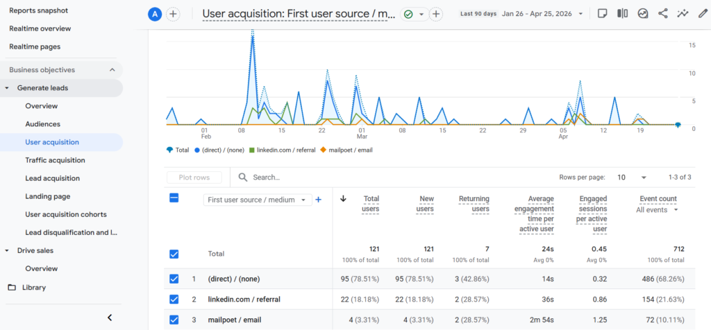
Average Engagement Time
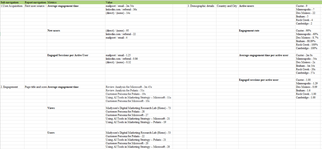
Prompt: “When I sorted the average engagement time in descending order in the First user source/medium classification, the following result came out. Please explain.
mailpoet / email – 2m 54s
linkedin.com / referral – 36s
(direct) / (none) – 14s”
ChatGPT’s response:
● “Short answer from ChatGPT
- mailpoet / email – 2m 54s: Email visitors spend the most time on your site, indicating highly engaged users who are already interested in your content.
- linkedin.com / referral – 36s: LinkedIn traffic shows moderate engagement.
- (direct) / (none) – 14s: Direct traffic has the lowest engagement.
● This data suggests your email marketing drives the most engaged traffic.”
New Users
Prompt: “When I sorted the new users in descending order in the First user source/medium classification, the following result came out. Please explain.
(direct) / (none) – 95
linkedin.com / referral – 22
mailpoet / email – 4″
ChatGPT’s response:
● “Short answer from ChatGPT
- (direct) / (none) – 95: Direct traffic brings in the highest number of new users.
- linkedin.com / referral – 22: LinkedIn is a solid source of new users.
- mailpoet / email – 4: Email generates very few new users.
● This data suggests direct traffic is your biggest driver of new users.”
Engagement (Engaged Sessions per User)
Prompt: “When I sorted the engaged sessions per active user in descending order in the First user source/medium classification, the following result came out. Please explain.
mailpoet / email – 1.25
linkedin.com / referral – 0.86
(direct) / (none) – 0.32″
ChatGPT’s Response:
● “Short answer from ChatGPT
- mailpoet / email – 1.25: Email users have the highest engagement.
- linkedin.com / referral – 0.86: LinkedIn users show moderate engagement.
- (direct) / (none) – 0.32: Direct users have the lowest engagement.
● This data suggests email drives the most consistently engaged users.”
Engagement – Page Title and Screens
Page title and screens show how users interact with specific pages on my website, helping me to understand which content performs best.
The metrics I focused on include:
- Average engagement time
- Views
- Users
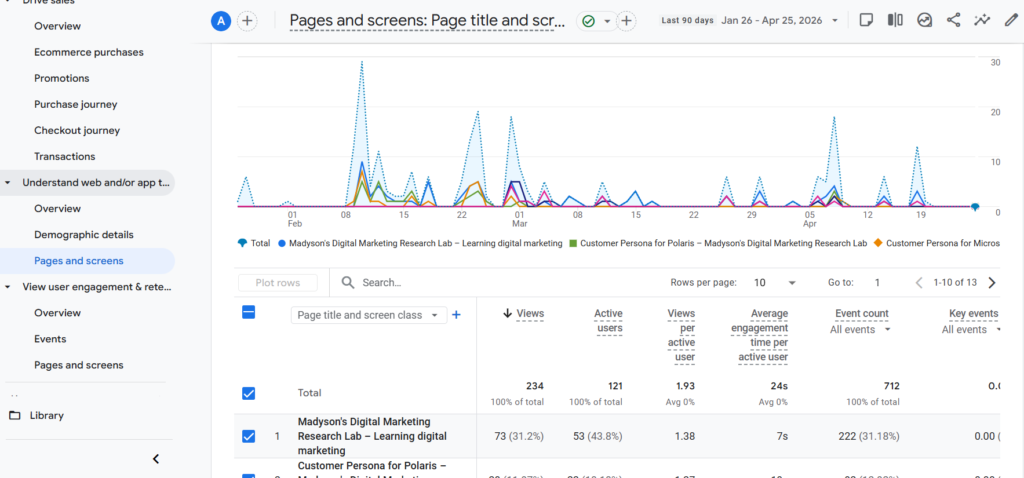
Average Engagement Time
Prompt: “When I sorted the average engagement time in descending order in the page title and screen class classification, the following result came out. Please explain.
Review Analysis for Microsoft – 3m 45s
Review Analysis for Polaris – 51s
Customer Persona for Polaris – 19s
Using AI Tools in Marketing Strategy — Microsoft – 11s
Customer Persona for Microsoft – 10s”
ChatGPT’s response:
● “Short answer from ChatGPT
- Review Analysis for Microsoft – 3m 45s: Highest engagement.
- Review Analysis for Polaris – 51s: Moderate engagement.
- Customer Persona for Polaris – 19s: Lower engagement.
- Using AI Tools in Marketing Strategy– Microsoft – 11s: Very low engagement.
- Customer Persona for Microsoft – 10s: Lowest engagement.
● This suggests review analysis content is the most engaging.”
Views
Prompt: “When I sorted the views in descending order in the page title and screen class classification, the following result came out. Please explain.
Madyson’s Digital Marketing Research Lab (Home) – 73
Customer Persona for Polaris – 28
Customer Persona for Microsoft – 27
Using AI Tools in Marketing Strategy — Microsoft – 21
Using AI Tools in Marketing Strategy — Polaris – 19″
ChatGPT’s Response:
● “Short answer from ChatGPT
- Homepage has the most views.
- Customer Persona pages follow.
- AI pages have moderate views.
● This suggests homepage and persona content drive the most traffic.”
Users
Prompt: “When I sorted the users in descending order in the page title and screen class classification, the following result came out. Please explain.
Madyson’s Digital Marketing Research Lab (Home) – 53
Customer Persona for Polaris – 22
Using AI Tools in Marketing Strategy — Polaris – 21
Customer Persona for Microsoft – 20
Using AI Tools in Marketing Strategy — Microsoft – 20″
ChatGPT’s response:
● Short answer from ChatGPT
- Homepage has the most users.
- Other pages have similar user levels.
● This suggests consistent interest across content types.
User Attribute – Demographic Details
Country and City demographics show where viewers are accessing my website from, allowing me to better understand where my audience is located and how engagement differs by location. For this data, I used a different approach, focusing on 6 cities of my choice, rather than the top 6 in the data.
The metrics I focused on include:
- Active users
- Engagement rate
- Average engagement time
- Engaged sessions per user
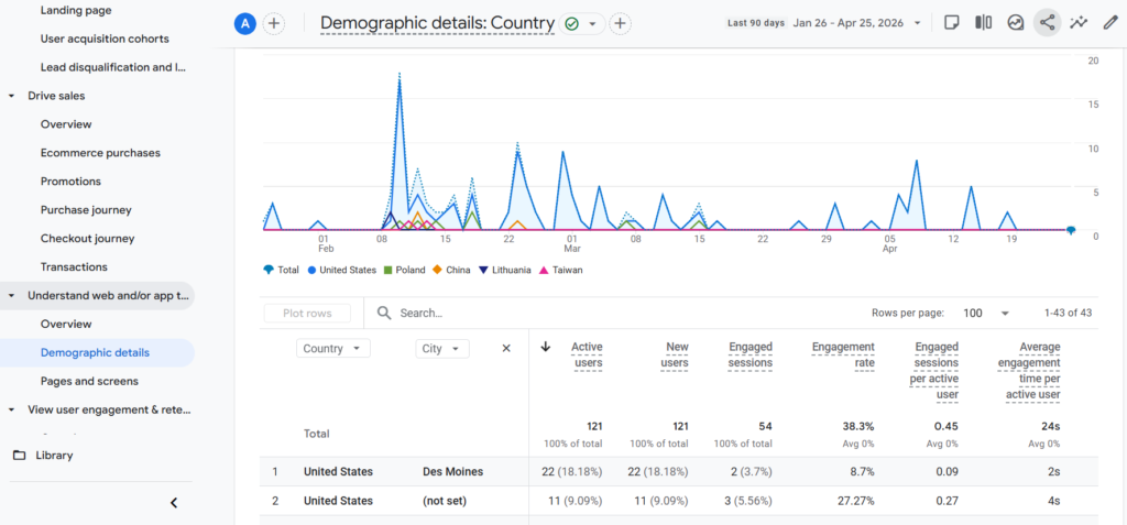
Active Users
Prompt: “Let’s begin the analysis assuming my cities of interest are Custer, Minneapolis, Des Moines, Braham, Rock Creek, and Cambridge.
When I sorted the active users in descending order in the country and city classification, the following result came out. Please explain.
Custer – 9
Minneapolis – 7
Des Moines – 22
Braham – 5
Rock Creek – 4
Cambridge – 2″
ChatGPT’s Response:
● Short answer from ChatGPT
- Des Moines – 22: This city brings in the highest number of users, making it your largest traffic source.
- Custer – 9: Moderate traffic, showing a smaller but notable audience.
- Minneapolis – 7: Similar mid-level traffic with some consistent visitors.
- Braham – 5: Lower traffic but still contributing users.
- Rock Creek – 4: Small audience size.
- Cambridge – 2: Lowest number of users.
● This suggests Des Moines drives the most traffic, while the other cities have smaller audiences.
Engagement Rate
Prompt: “When I sorted the engagement rate in descending order in the country and city classification, the following result came out. Please explain.
Custer – 90%
Minneapolis – 60%
Des Moines – 8.7%
Braham – 88.89%
Rock Creek – 100%
Cambridge – 100%”
ChatGPT’s Response:
● “Short answer from ChatGPT
- Rock Creek – 100%: All users engaged, indicating very high-quality traffic.
- Cambridge – 100%: Same as Rock Creek, but with a very small sample size.
- Custer – 90%: Very strong engagement with a decent number of users.
- Braham – 88.89%: Also highly engaged audience.
- Minneapolis – 60%: Moderate engagement.
- Des Moines – 8.7%: Very low engagement despite high traffic.
● This suggests smaller cities bring more engaged users, while Des Moines traffic is less qualified.”
Average Engagement Time
Prompt: “When I sorted the average engagement time in descending order in the country and city classification, the following result came out. Please explain.
Custer – 2m 0s
Minneapolis – 54s
Des Moines – 2s
Braham – 1m 14s
Rock Creek – 20s
Cambridge – 57s”
ChatGPT’s Response:
● “Short answer from ChatGPT
- Custer – 2m 0s: Users spend the most time here, indicating strong interest.
- Braham – 1m 14s: Also high engagement time.
- Cambridge – 57s: Moderate time spent.
- Minneapolis – 54s: Similar moderate engagement.
- Rock Creek – 20s: Short visits.
- Des Moines – 2s: Extremely low time, suggesting users leave almost immediately.
● This suggests Custer and Braham users are most interested, while Des Moines users are not staying.”
Engaged Sessions per User
Prompt: “When I sorted the engaged sessions per user in descending order in the country and city classification, the following result came out. Please explain.
Custer – 1.00
Minneapolis – 1.29
Des Moines – 0.09
Braham – 1.6
Rock Creek – 1.00
Cambridge – 1.00″
ChatGPT’s Response:
● “Short answer from ChatGPT
- Braham – 1.6: Highest interaction per user, indicating repeat or deeper engagement.
- Minneapolis – 1.29: Good level of interaction.
- Custer – 1.00: Solid engagement consistency.
- Rock Creek – 1.00: Consistent but limited depth.
- Cambridge – 1.00: Similar consistent engagement.
- Des Moines – 0.09: Very low interaction per user.
● This suggests Braham and Minneapolis users interact the most, while Des Moines users rarely engage beyond a single brief visit.”
Overall Takeaways
Looking at all of these metrics together, I found a clear pattern:
- Des Moines = high traffic, low engagement
- Smaller cities (Custer, Braham, etc.) = lower traffic, high engagement
This tells me that my website is attracting a lot of visitors from Des Moines, but they are not the right audience. Meanwhile, users from smaller cities are much more aligned with my contact and are spending time engaging with it.
Going forward, I would:
- Focus on attracting more users similar to those in Custer and Braham
- Investigate why Des Moines traffic is so low-quality (possibly wrong targeting, misleading links, or irrelevant content)
Overall, this analysis helped me understand that not all traffic is good traffic, and engagement metrics are just as important–if not more important–than user volume.